


Taking a step forward and improving your photography skills, we look at adjustments one can make on a point and shoot camera. In this scenario I used my Canon PowerShot SX100 IS and its My Colors function. It’s possible that your camera has the same or similiar capability but will be called something else. Peruse your manual for these key words, color and/or contrast.
At Epcot in the Morocco Pavilion on a partly sunny day, I sat in one spot and changed settings for each photo. To use these advanced settings, your camera must be dialed to P, Av, TV, or M. Press the Function button and scroll down to My Colors and then move right to Custom Color and press the DISP (display) button. The arrows on the left let you go up and down between Contrast, Sharpness, and Saturation. The integer bar on the right lets you guide the arrow from left to right, increasing and decreasing each setting one by one. We will explore sharpness and saturation at a later time.
The integer bar has 5 options. From left to right they are minus 2, minus 1, zero, plus 1, and plus 2. Provided are three examples of how using in-camera contrast makes a difference in your photos.
Photo One – Set to minus 2, this image is very full and flat. Nothing stands out.

Photo Two – Taken at zero or in the middle, the yellow pop out the most with greens in a close second. The separation is alright but nothing spectacular.

Photo Three – Set to plus 2, the contrast in this photo is obvious as all colors are bright and the whites are clean and crisp. his photo is sure to grab far more attention than the others.

Increasing color contrast works best on things such as flowers, landscapes, and architecture versus on people and pets. It’s also handy on very overcast days when lighting is soft and flat.
I’m on Facebook. Are you?


Trending Now
TSA just banned an essential travel item from checked luggage!
Believe it or not, it is possible to make a day at EPCOT even better!
Don't forget about this change coming up for Disney World hotel guests!
Six Flags has just announced that they're CLOSING on of their theme parks entirely this...
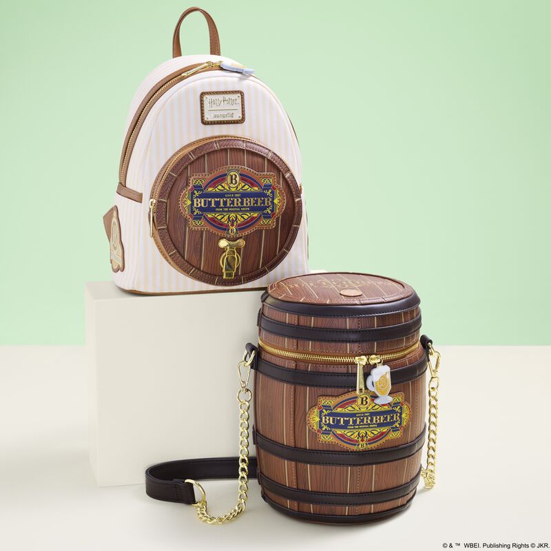
If you adore Butterbeer from Harry Potter as much as we do, these TWO new...
These Disneyland attractions will be closed for part of or all of May.
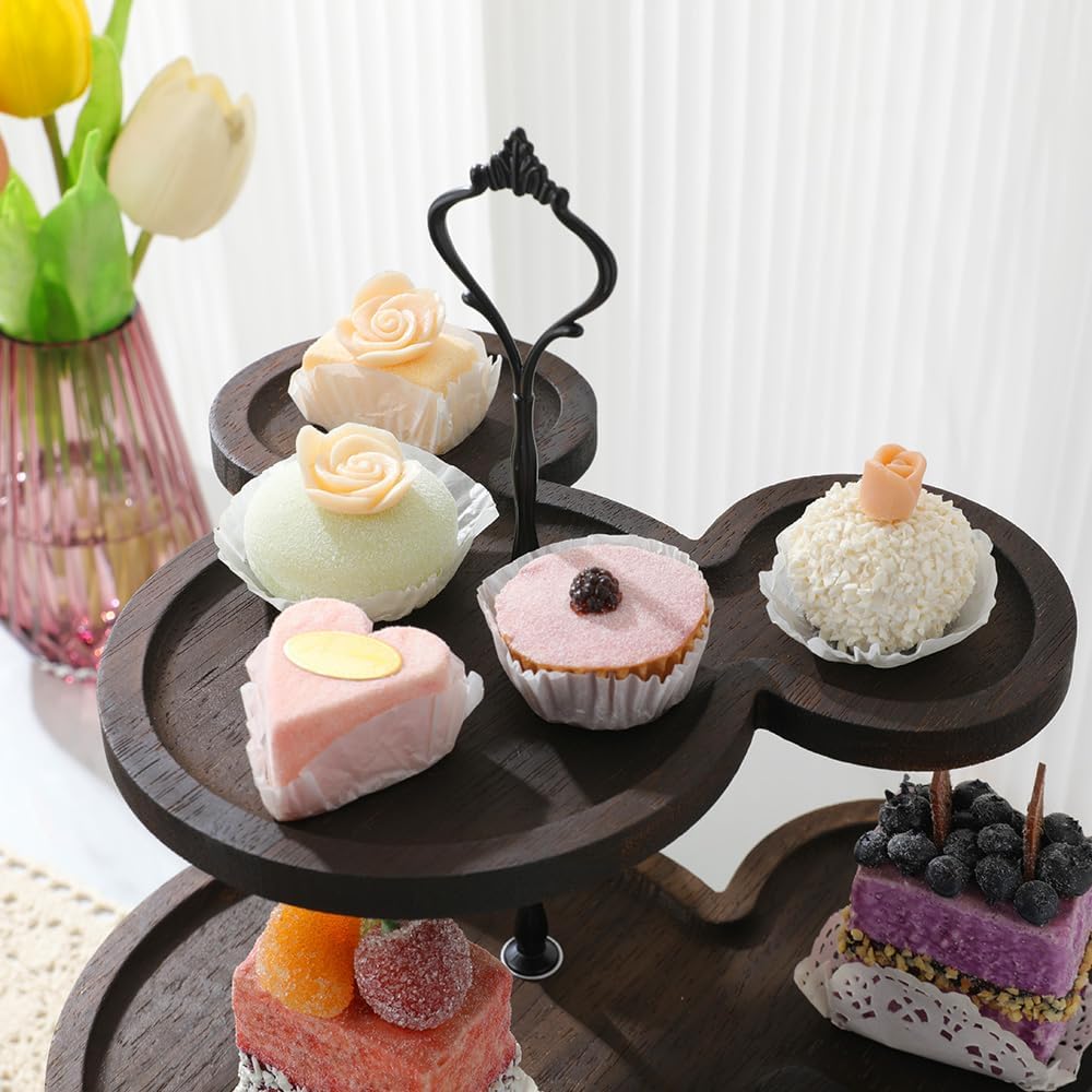
Each week, we search high and low for the best Disney deals on Amazon. Wanna...
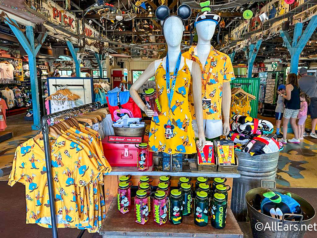
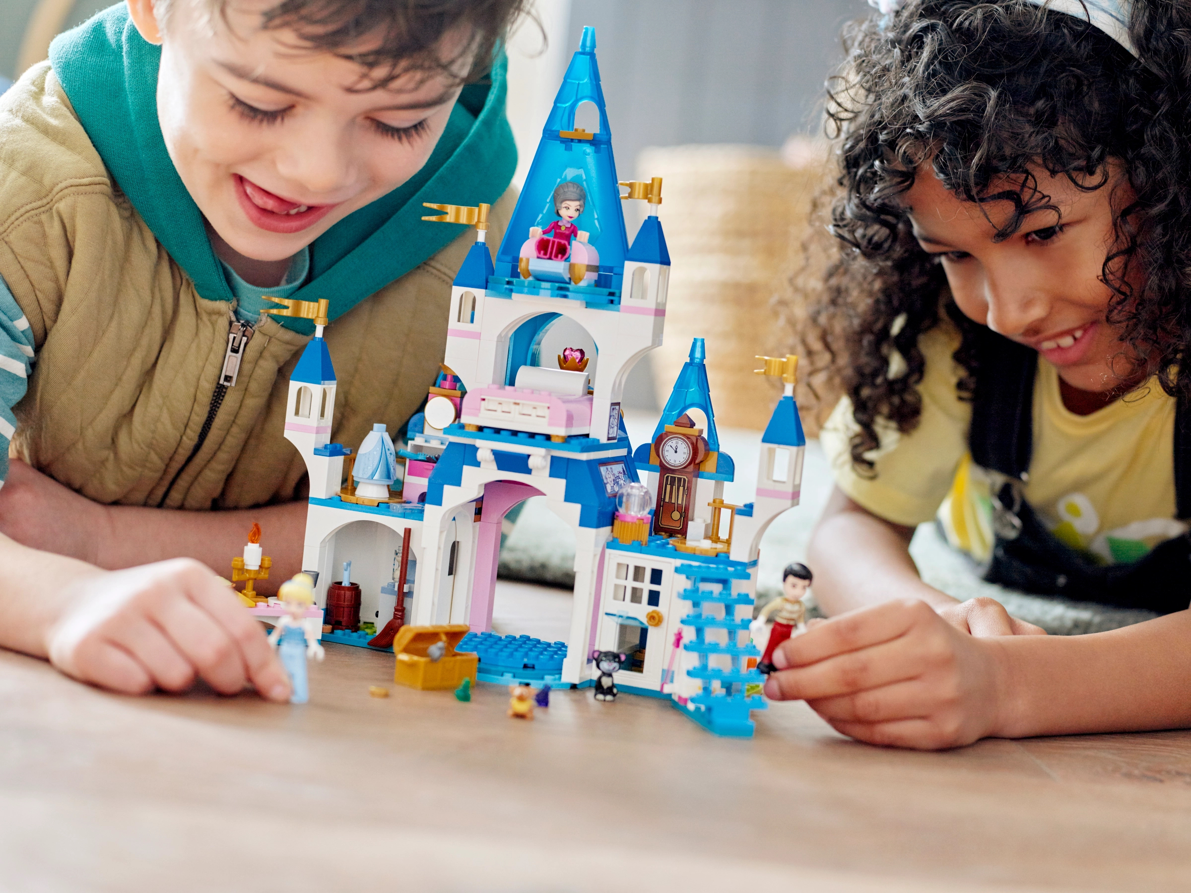
We're sharing the hottest deals on LEGO sets on Amazon!
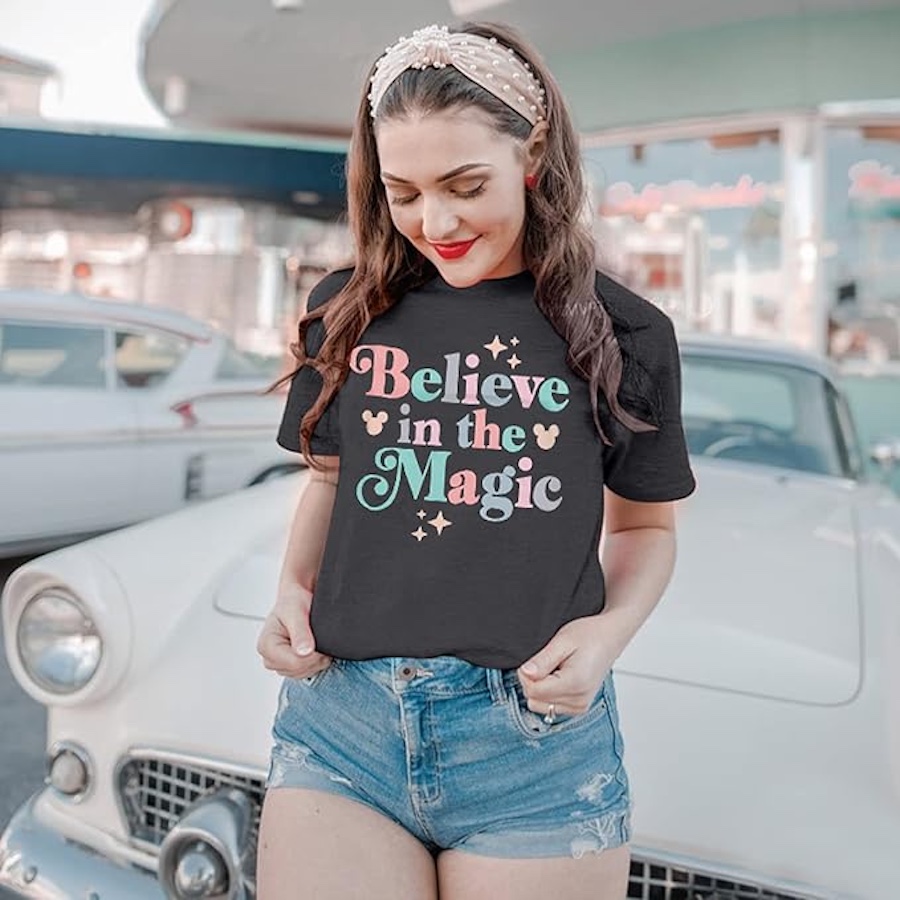
Need a new Disney tee? Get to Amazon NOW!
Only true Disney adults are packing these items for their Disney World trips!
By unanimous vote, the proposed Sunshine Corridor study is now fully funded.
The best upgrades available for Disney Cruise Line Passengers.
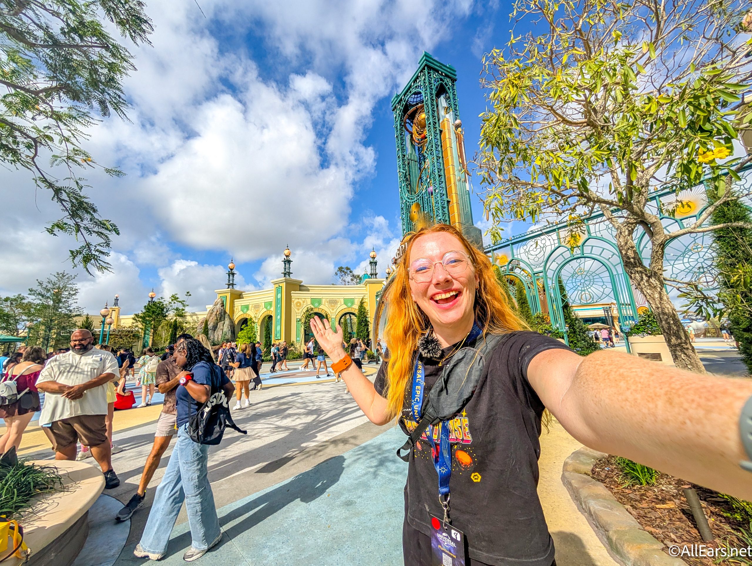
Epic Universe is amazing…but it does have a couple of flaws.
Here are a couple of things you'll want to get yourself because every Disney Adult...
We spotted three brand-new Disney Loungefly bags online, and one of them is already selling...
Every Disney adult is going to Amazon to buy their Disney park day shoes!
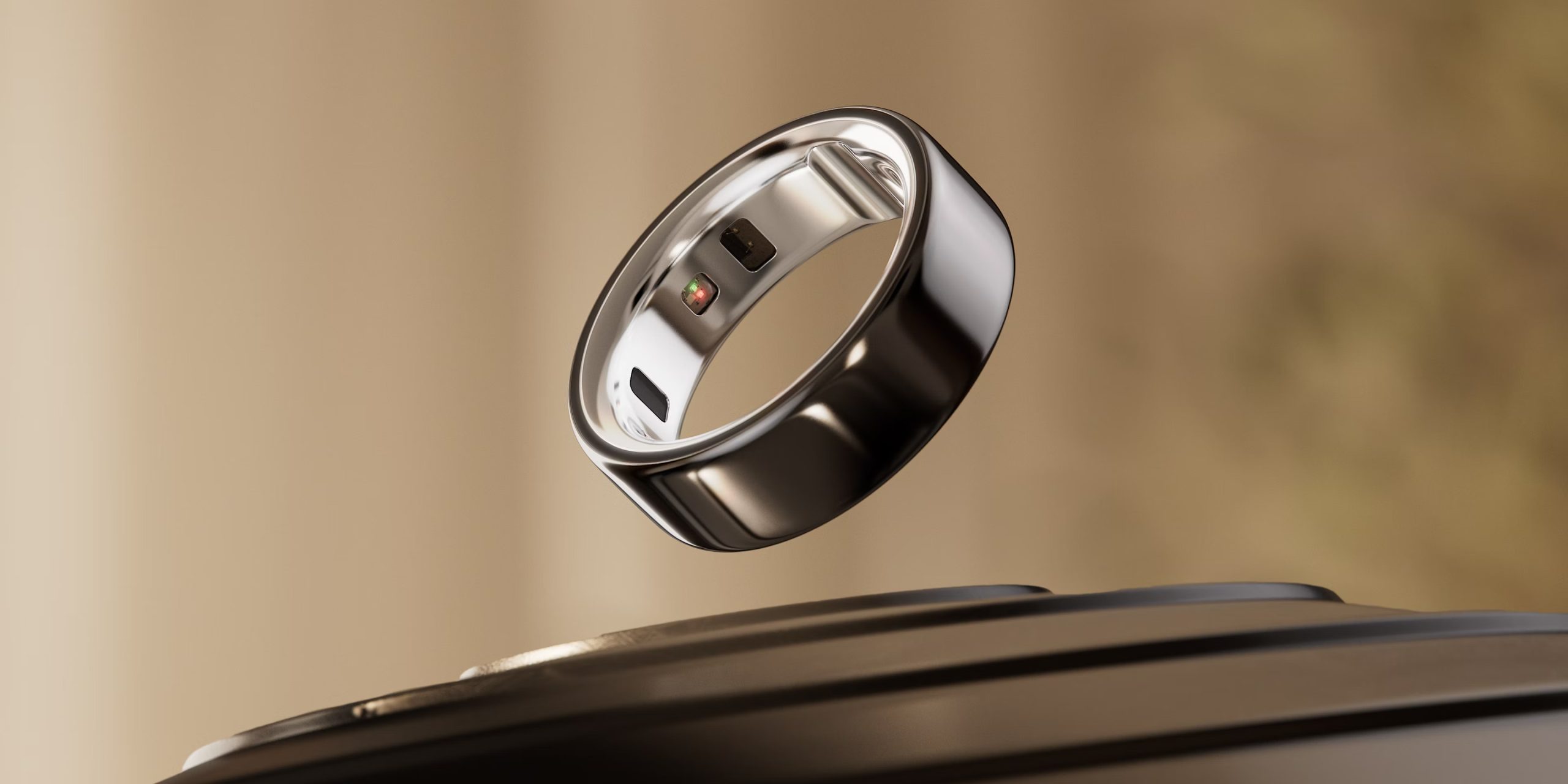
Let's talk about why every Disney Adult is buying an Oura Ring from Target right...
Many Disney guests don't realize they're breaking these rules.
These might be weird buys, but we aren't kidding when we say you'll need them...
A Universal x Minecraft experience is HERE!